RSPWN
- Logo
- Online store
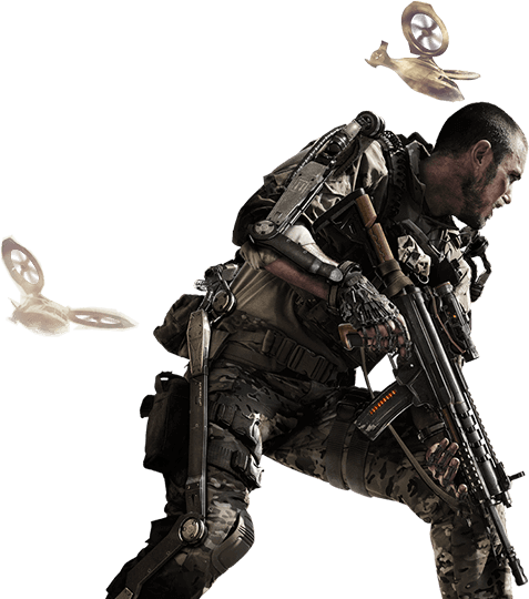
RSPWN is a new gamewear brand dedicated to all hardcore players. It doesn't matter if your anthem is “EA Sport it’s in the game” or if you prefer to traverse the Summoner's Rift by setting up invisible, poisonous mushrooms everywhere, or playing AP LUX on a support. Even if you are a "Rush B!" strategist then any of your respawns on rspwn.gg is more than welcome!
We made the logo and a functional model of an online store (UX / UI) ,on the basis of which we designed and implemented a sales platform for a brand which has of the most recognizable eSports teams in Poland - IZAKO BOARS as their front man.
Logo
RESPAWN is being reborn - if you lose your life in the game, you have a chance to start again, usually from the very beginning. In the logo we designed, arrows pointing in opposite directions and shown in the negative space of the logotype symbolize this.
A simple, bolded, sans serif font, emphasizes the professionalism and reliability of the brand, and the slight slant of the letters highlights its dynamism. After all, the world of gaming and its fans is a demanding industry in which continuous development is the very basis.
Only so much and as much.There is no room for quirks. RSPWN is a specific brand for those who always fight till the end.

Black CMYK
000
Gold CMYK
RGB
000
RGB
HEX
000000
HEX
ffffff
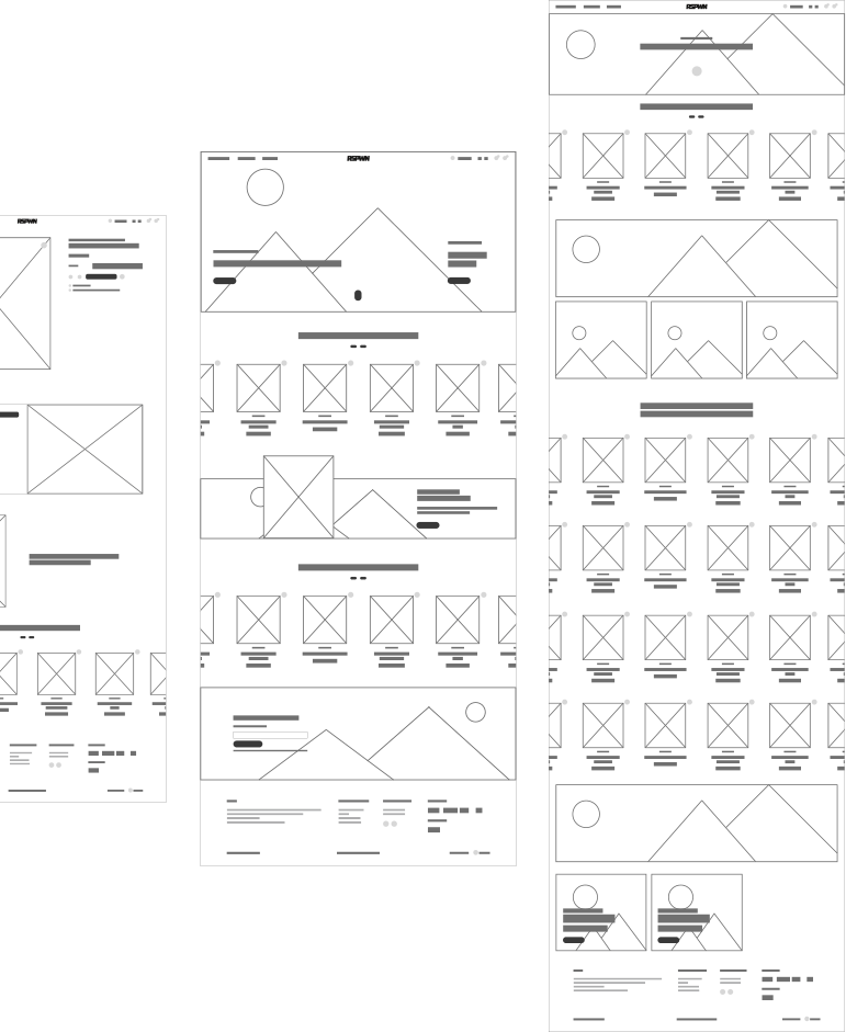
Layout
Wherever the goal is to convert a visitor to sales, we strongly focus on the user's experience affecting his purchasing decisions. These are often emotional, so in order to maximize the chance of conversion, the prototype was designed in such a way that the website effectively accomplishes the goals discussed with the Client during project workshops.
The layout was created based on the needs of future users and the best solutions currently used in e-commerce industry. We built a sense of belonging and community thanks to numerous references to the team.
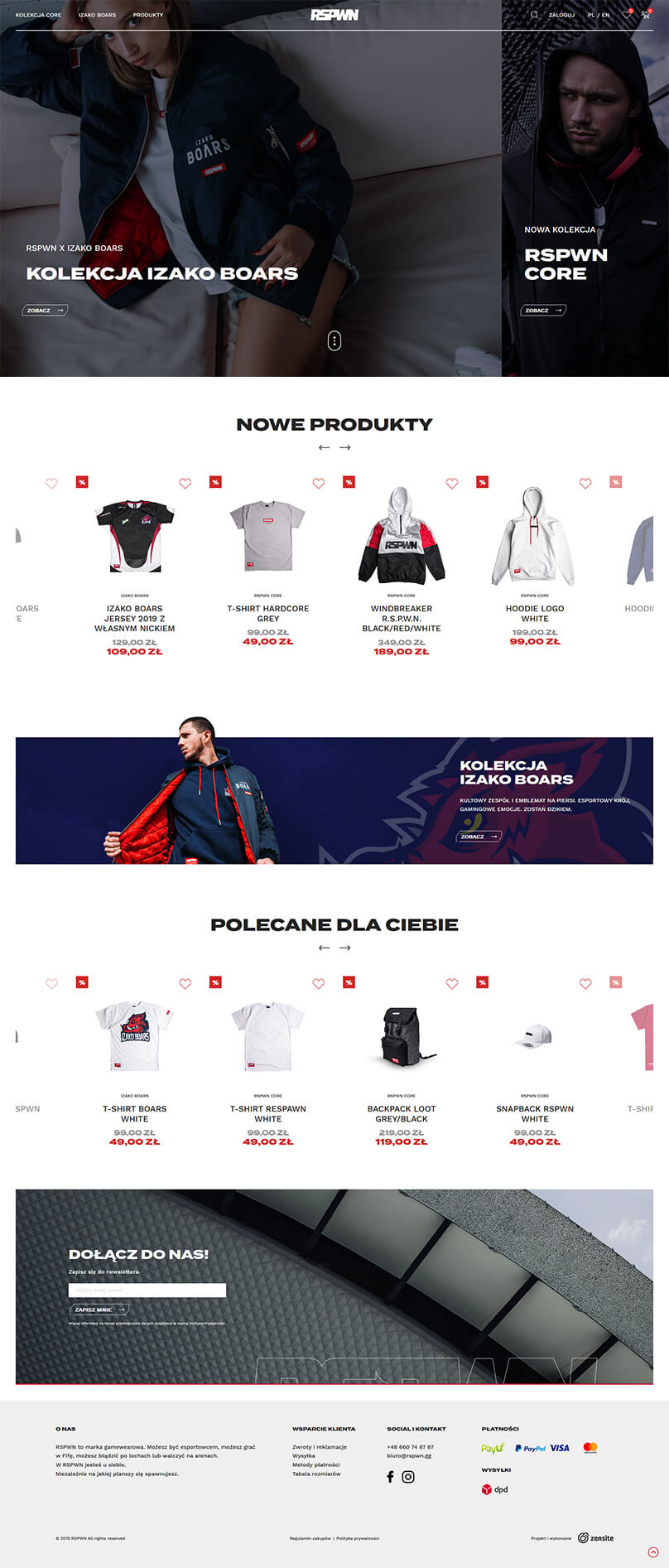
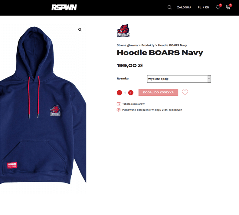
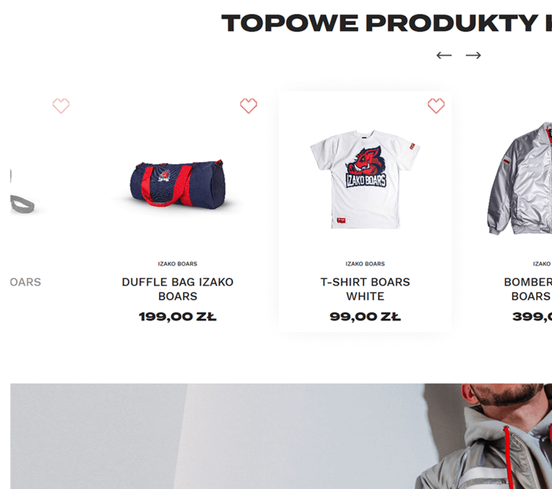
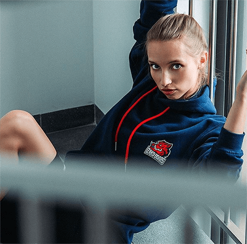
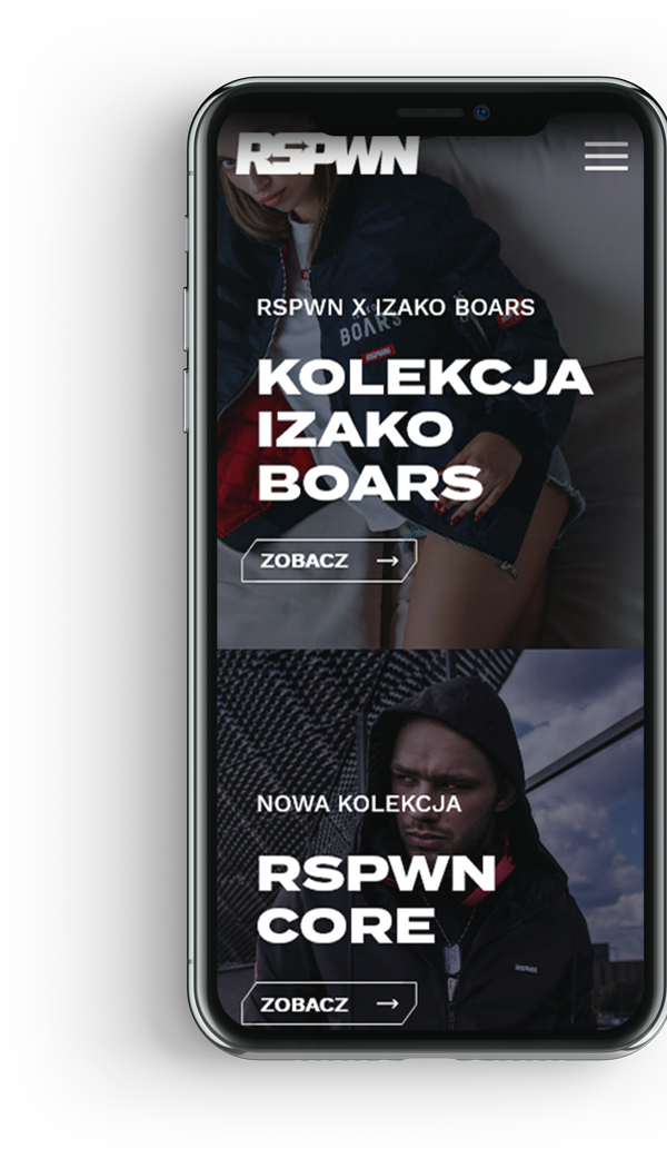
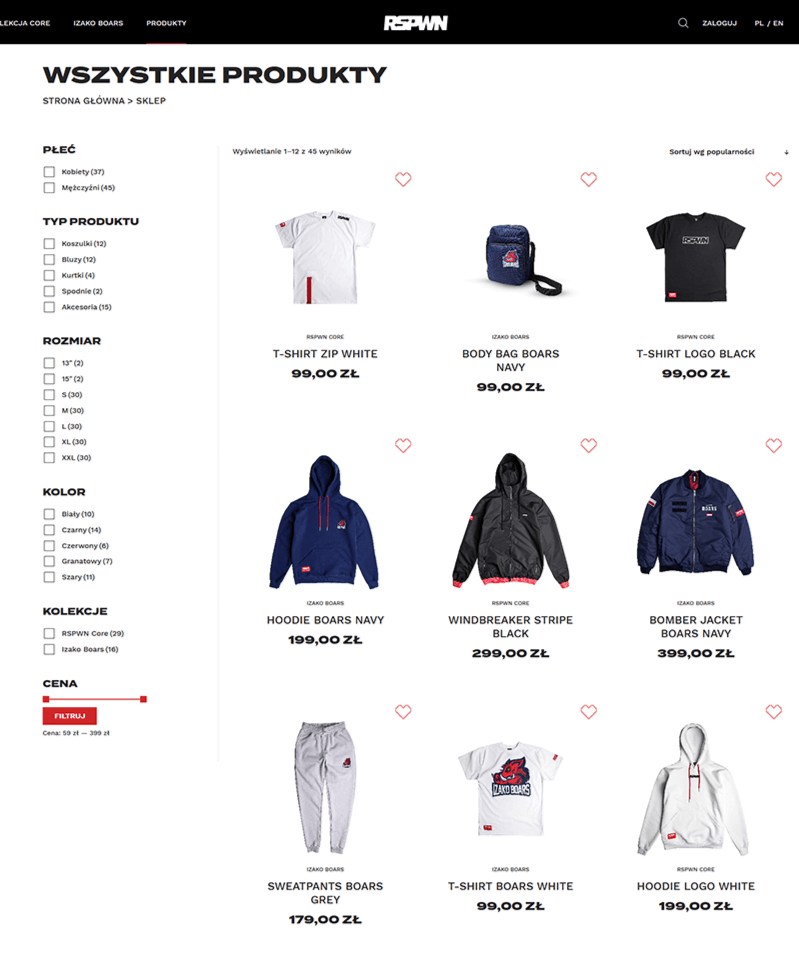
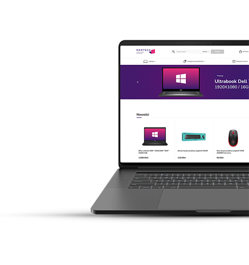
eStore
The CORE collection signed with the RSPWN sign and the IZAKO BOARS collection had amazing design, so we had to prepare the right background for them. The presentation of products is extremely important, therefore. we gave up on any unnecessary ornaments and other distractions by putting on a simple design oscillating around the theme (e.g. the pixel icon 'add to favorites'). Again, we focused on simplicity and dynamism, after all, the site must be tailored to your audience. Products were supposed to reign in here.
As a result of the analysis of needs, brand development plans in terms of product offer and the budget, we decided together with the Client that at this stage the best solution would be to base the implementation of the website on a flexible WooCommerce engine that meets the requirements of all the assumed project needs. We also took care of the comfortable use of the store on mobile devices so that the store would be available to all of its customers on any device.
GL&HF!