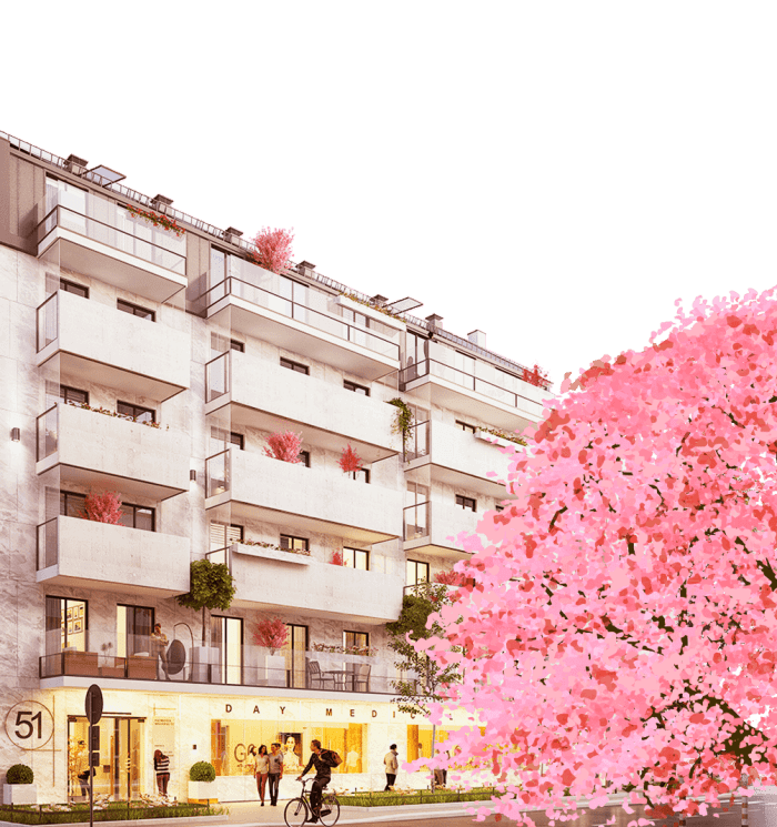
Kazimierza
Wielkiego 51
- Logo
- Website
- Advertising materials
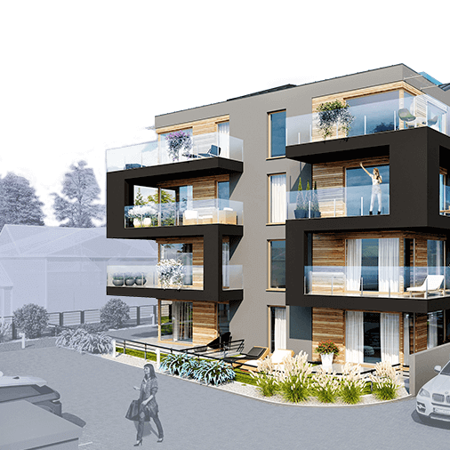
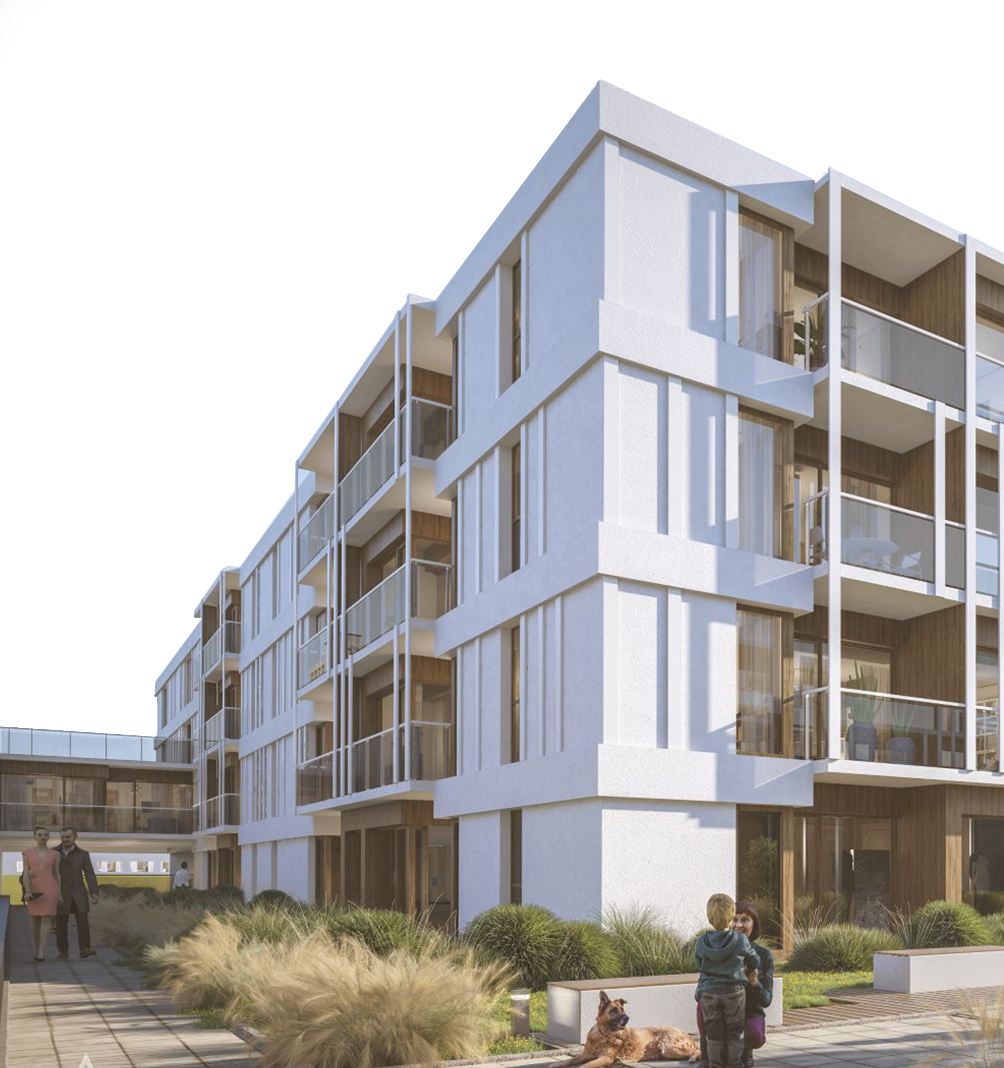
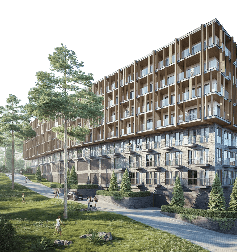
The developer already had a website created by another company and planned to change the agency that was responsible for generating sales leads. We carried out an audit of the campaign, which showed that the campaign was poorly managed In addition, the created website did not reflect the values of the project in any way, but together with the Client we agreed that the test month of the campaign will be made to verify whether the improvement of the campaign itself would affect the achievement of the intended goals. Unfortunately, the test month confirmed our suspicions. The website was supposed to present the atmosphere of Japan, while the only thing that referred to Japan was the illegible logo and a cherry on the visualizations provided by the developer. Blue and pink colors were completely not suited to the theme of the project that was supposed to be tied to Japan.
Logotype
We approached the project completely from scratch. When designing the new logo, we focused on the simplicity and the possibility of using the logo on the building, integrating the Japanese font into the city identification regarding the markings of Krakow buildings.

Previous logo

New logo

Logo
Black CMYK
000
White CMYK
RGB
000
RGB
HEX
000000
HEX
ffffff
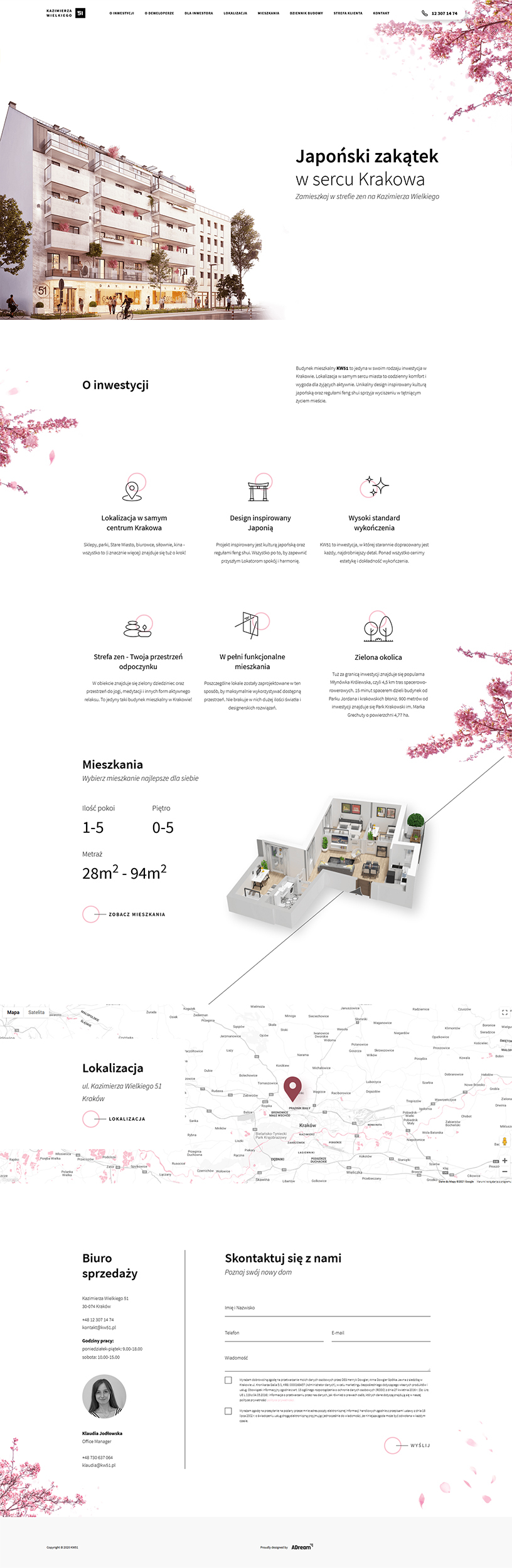
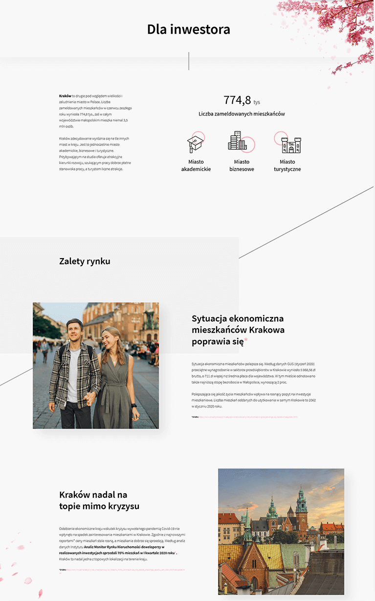
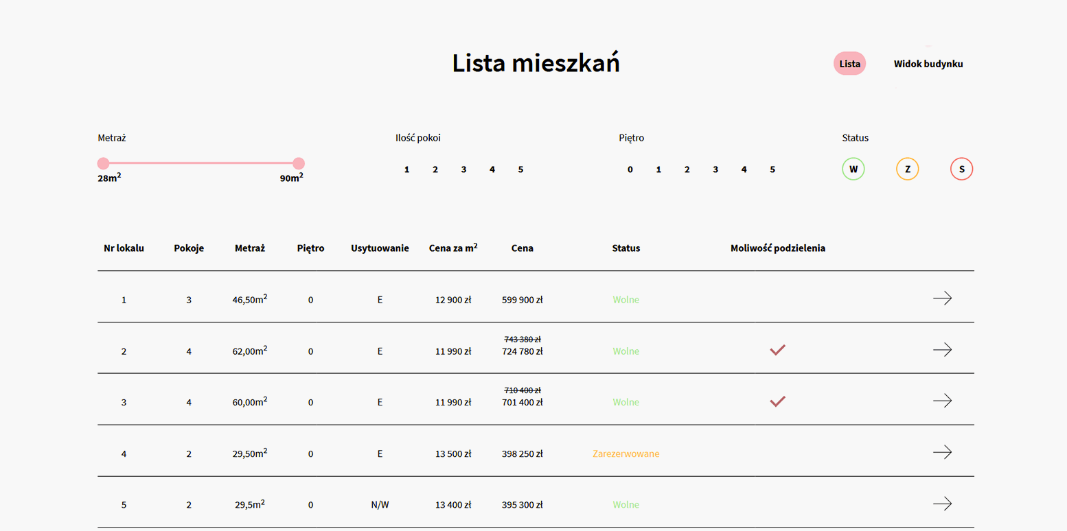
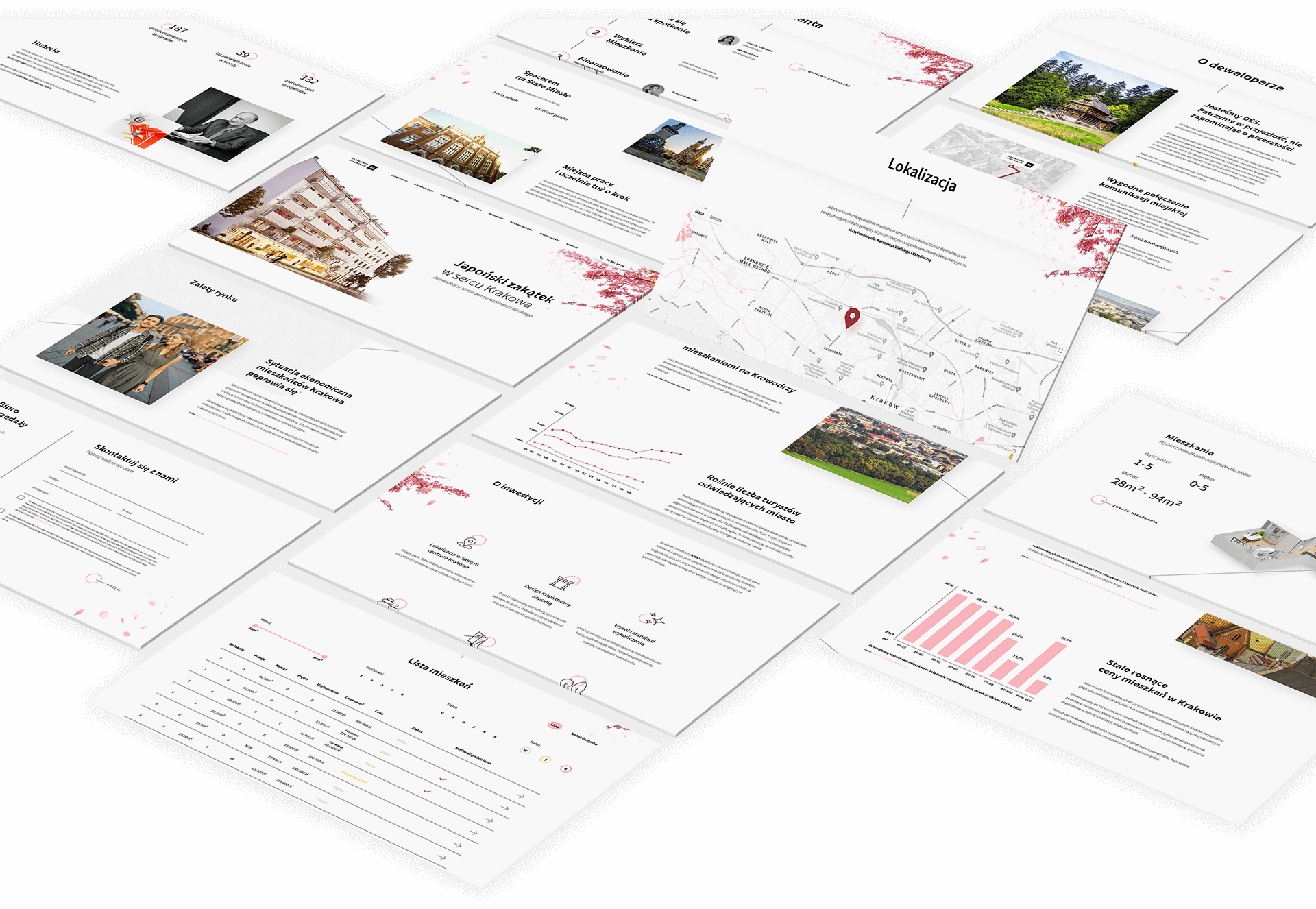
We have shown how the values of flats have changed over the years, why Krowodrza is interesting for investments, and presented data on tourist traffic in Krakow. We described the standard, design and nature of the developed facility. We have created a completely new apartment presentation system and showed why the potential buyers can trust the real-estate developer responsible for the project. The website gained transparency and began to build positive experiences among users, which we observed in the recordings of the sessions of users visiting the website and their behaviour.
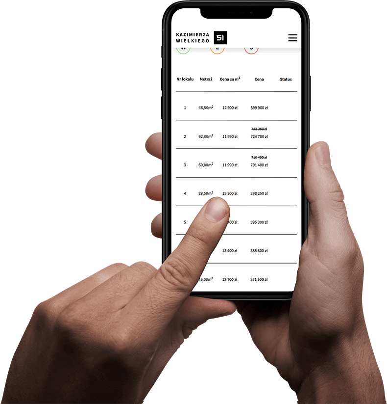
Website
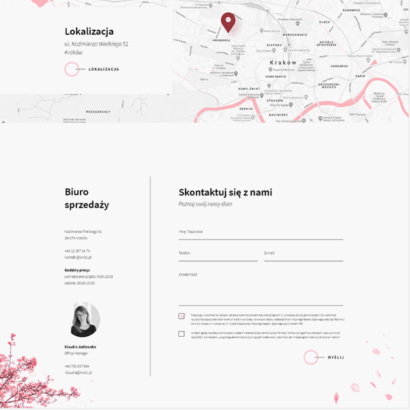
The website has been rebuilt not only in the visual aspect. We have developed a completely new investment communication strategy and greatly expanded the location tab, showing all the key aspects of the investment project. Additionally, we have created a tab directed specifically to investors, where we have presented information on why it is worth to invest in Kraków.
Advertising campaign
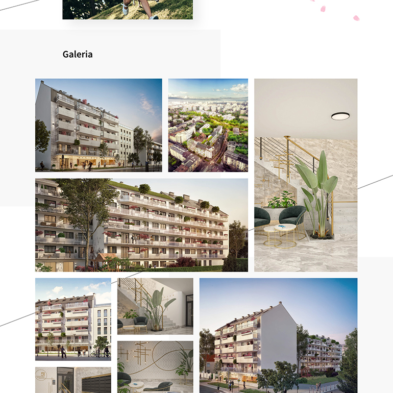
For the purposes of the project, we have developed a unique Key Visual accompanying the project in all graphic materials.
For the new website we've launched a campaign targeted at investors and customers looking for a flat. The apartments were not the cheapest, as we oscillated in the range of 11,300 - 13,900 PLN per m2, which is why our campaign was targeted mainly at clients who bought flats for investment purposes. The situation in Poland in the period of 02.2020 - 12.2020 was not favorable for the developer due to the pandemic crisis, but the leads gained through the new website allowed for partial reservations of the apartments, contact with more parties interested in the project, and building a base of investors, which could never happen without a complete makeover.
On the basis of the campaigns carried out during the pandemic, we observed that at that time, apartments between PLN 6,000 and 8,000 per m2 and houses with a garden near Kraków sold best. Due to the huge collapse in the tourist market, apartments in the center were not as popular as before February 2020, when investors were mainly interested in ROI and not the price per m2 because Booking and AirBnB were driving customers their way well enough.
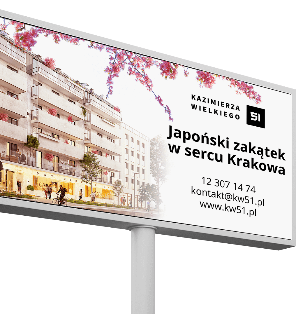
Outdoor Ads
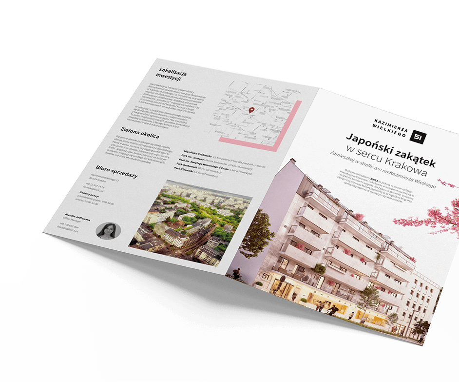
To support the sales office, we have prepared an advertising brochure containing the most important information about the project.
In addition, we have prepared a number of outdoor advertisements that were designed to inform the potential customers and investors about the progress of construction works and encourage them to visit the website.